MA Government Website CHIA – Center for Health Information & Analysis
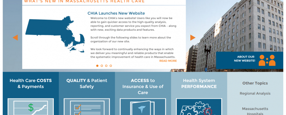
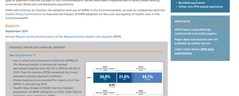
Polar Design has worked with Massachusetts government agencies and initiatives in the past to create dynamic, engaging websites. We worked with the Massachusetts Center for Health Information and Analytics in 2014 to create responsive, modern web site. CHIA wanted a website that would be straightforward and easy to navigate, with clear calls-to-action for each of their target audiences. The challenge presented was the vast amount of data, publications, charts, and other content that CHIA wanted to make available – it all had to be organized in a manner that could be quickly found by different types of users with varying strategies to browse and search the site.
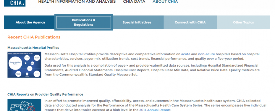
CHIA’s content defied simple hierarchical categorization. Polar Design worked closely with CHIA, and the teams came up with a “Stories” approach, with three main channels. These channels, Information, Data, and Admin, serve as anchors to different sections of CHIA’s offerings, including data, analysis, organizational info, and more. The site also allows for cross linking of articles and pages if they fall under multiple categories and would be useful for different audience types. Overall, the “stories” approach was an innovative way for CHIA to present their data in an organized and manageable way.
In addition to this front-end organization, the site uses SilverStripe as the Content Management System, allowing CHIA full access to back end functionality and to create a wide variety of page layouts and content. Admins can add or delete pages, edit content such as photos and text, rearrange the site tree, and upload images, reports, data and analysis at any time. This access gives CHIA the flexibility to change the website whenever they see fit, and always keep their information fresh and up-to-date.
Working with CHIA’s existing branding, Polar Design created a look and feel that leveraged its updated, modern branding while adding fresh energy to the site. The result is a clean, professional look with sleek blues and a orange accents that provide additional pop.
Polar Design also created the site using best practices for responsive design, ensuring that the site would view properly on desktop, mobile and tablet. Responsive design has been proven to retain more site visitors than non-responsive design, and so was an important factor. The various audience types visiting the CHIA site also meant that responsive design would be best, as people will be visiting the site on multiple devices. Overall, the redesigned site is appealing, easy to navigate and a great example of an innovative government website.


